The H Club Karaoke Experience
Tags
Tags
Exploration
Mobile Apps
Project
Overview
Project Overview
Karaoke, Redefined for a Luxury Venue
The standard, off-the-shelf karaoke software used in many venues felt clunky and out of place within The H Club's premium, high-energy atmosphere. For guests, the generic interface was difficult to navigate in a dark, loud environment, which killed the party's momentum. For the business, it required frequent staff assistance and detracted from the club's curated, high-end brand experience.
The standard, off-the-shelf karaoke software used in many venues felt clunky and out of place within The H Club's premium, high-energy atmosphere. For guests, the generic interface was difficult to navigate in a dark, loud environment, which killed the party's momentum. For the business, it required frequent staff assistance and detracted from the club's curated, high-end brand experience.
Years
2025
2025
Client
Holywings
Holywings
Roles
UI/UX Designer
UI/UX Designer
A Story behind the Karaoke Project
A Story behind the Karaoke Project
My process was rooted in deep, contextual user research to ensure the final design thrived in its unique environment.
Deep Dive Research: I began with stakeholder interviews to understand the core challenges from two key perspectives:
Business & Operations: I interviewed the Karaoke Vendor and the club's Outlet Manager to map out technical constraints, business goals, and operational pain points for the staff.
Context & Environment: I conducted on-site observation at The H Club to analyze the real-world use case. I studied the low-light conditions, the high-energy ambiance, and how guests actually interacted with the screens in a social setting.
"Vibe-Proof" Design: The research insights directly informed my UI/UX decisions:
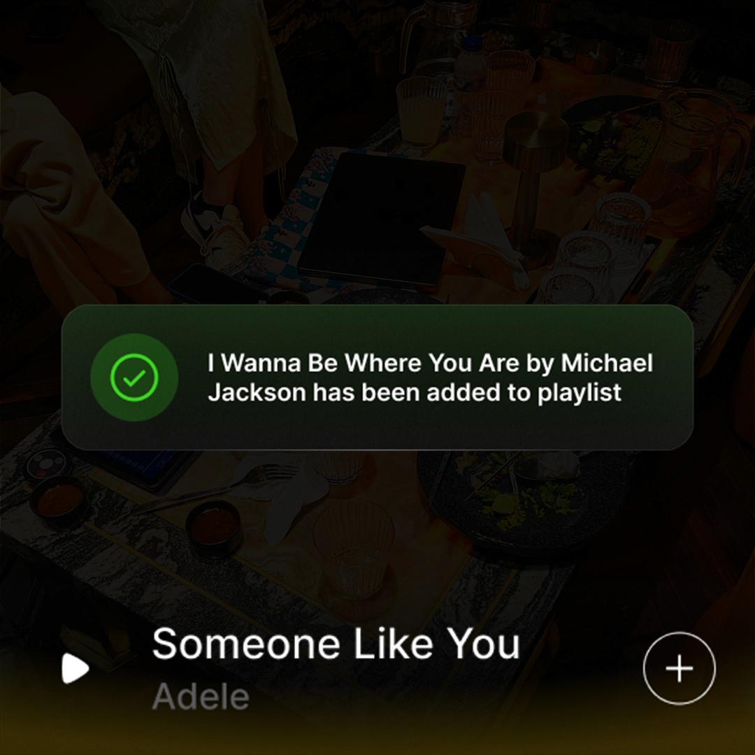
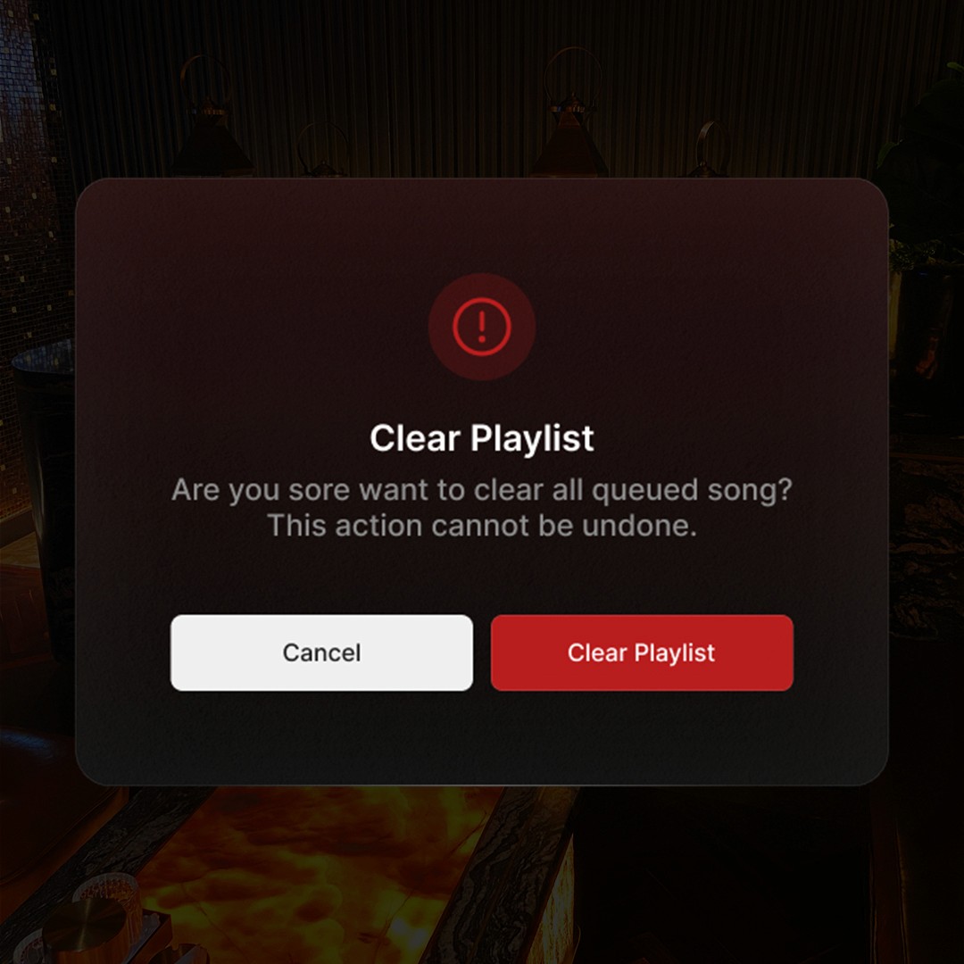
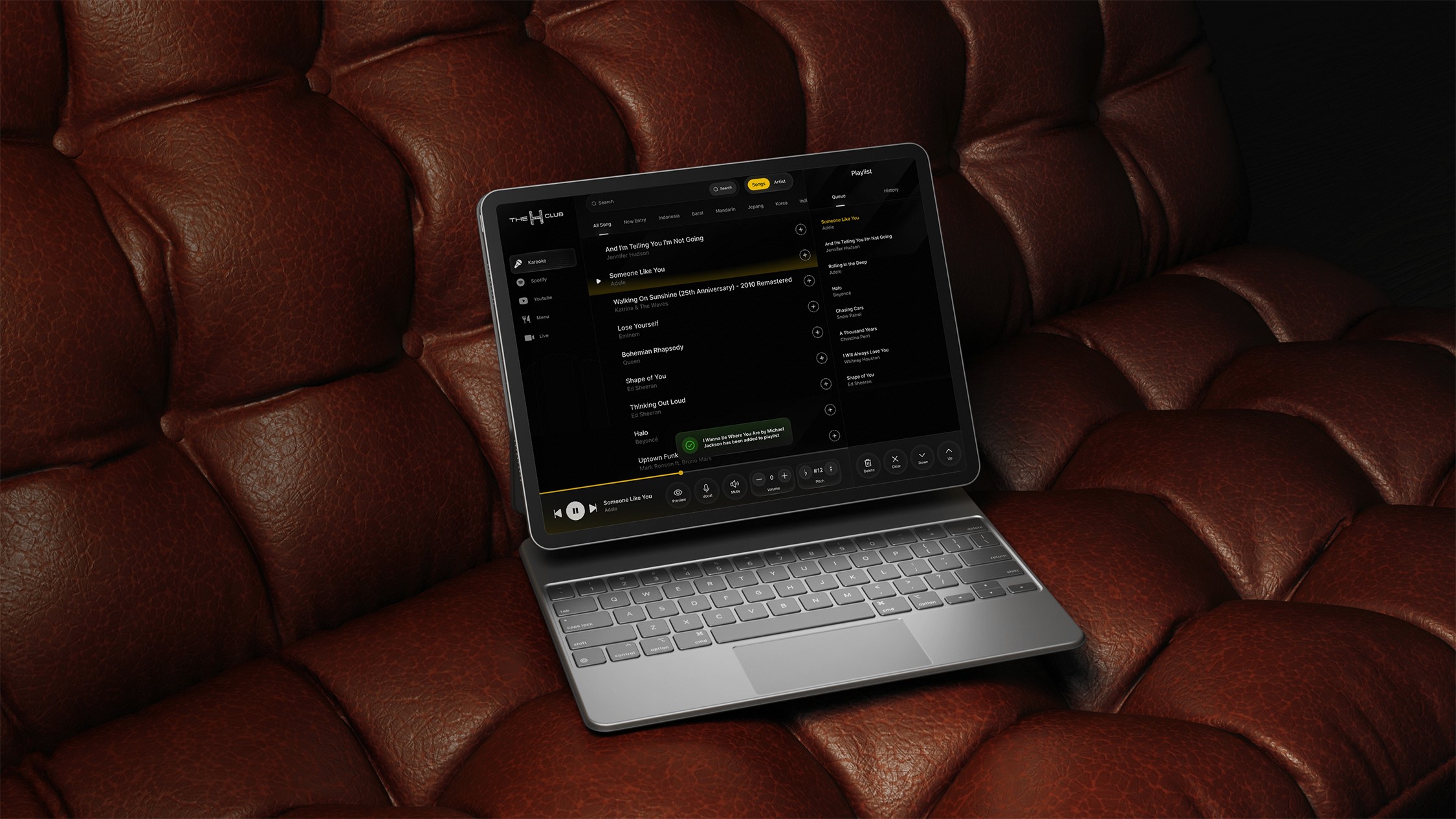
High-Contrast, Branded UI: I developed a sleek, dark-mode interface with large, legible fonts and high-contrast controls, all aligned with The H Club's sophisticated branding.
Simplified User Flow: I streamlined the entire navigation, reducing the number of taps required to search for and queue a song. The focus was on getting users back to the party as quickly as possible.
Large, Forgiving Touch Targets: All interactive elements were made significantly larger to ensure effortless use, even in a dynamic, social setting where precision is difficult.
My process was rooted in deep, contextual user research to ensure the final design thrived in its unique environment.
Deep Dive Research: I began with stakeholder interviews to understand the core challenges from two key perspectives:
Business & Operations: I interviewed the Karaoke Vendor and the club's Outlet Manager to map out technical constraints, business goals, and operational pain points for the staff.
Context & Environment: I conducted on-site observation at The H Club to analyze the real-world use case. I studied the low-light conditions, the high-energy ambiance, and how guests actually interacted with the screens in a social setting.
"Vibe-Proof" Design: The research insights directly informed my UI/UX decisions:
High-Contrast, Branded UI: I developed a sleek, dark-mode interface with large, legible fonts and high-contrast controls, all aligned with The H Club's sophisticated branding.
Simplified User Flow: I streamlined the entire navigation, reducing the number of taps required to search for and queue a song. The focus was on getting users back to the party as quickly as possible.
Large, Forgiving Touch Targets: All interactive elements were made significantly larger to ensure effortless use, even in a dynamic, social setting where precision is difficult.
A karaoke interface should be more than a utility; it should be part of the show. This design enhances the club's energy, making song selection as seamless and exciting as the performance itself.